Ligature Logo Project
- Nov 30, 2016
- 2 min read


What is a ligature logo?
A Ligature logo is made of letters combined together to create a special logo or symbol. Letters can be combined by techniques such as angled to vertical, shared strokes, horizontal crossbars, remove a stroke, interlock, and many more. Most logos are pleasing to the eye and simple therefore, making the logo easier to remember and more recognizable.
How would describe the corporate identity of ESMA in 5 words?
Music, fresh, pop, classical, jazz
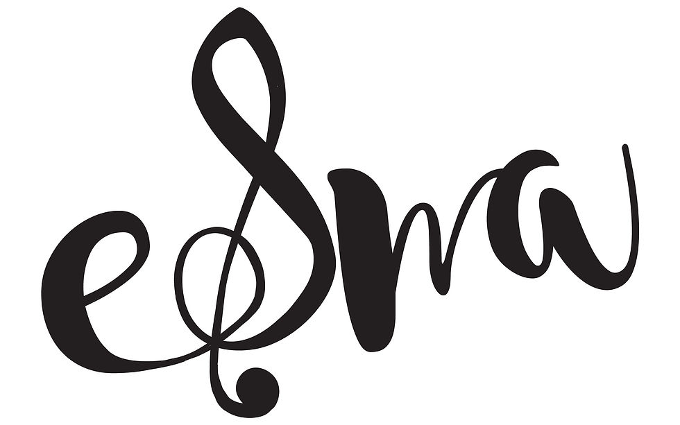
Which logo out of the two do you feel is the strongest and why?
I feel that my first logo was the strongest because it incorporates more of ESMA's character into it. The treble clef symbol that is incorporated with the S shows that ESMA has something to do with music. In addition, I feel that the logo is easy to remember because it is unique and eye catching.
If you had no requirements or restrictions how would your logo look different?
I would use more colors and graphics if I had no requirements because I think that it's easier to incorporate the company's identity with more graphics. Also, more colors and graphics would make the logo bolder and fresher.
Explain which ligature techniques you have demonstrated on each logo:
In my first ligature, I mainly used shared strokes to combine the E to the S and the M to the A. The bottom stroke of the E flowed into the S that looked like a treble clef whereas, the A acted as a replacement for the last line of the M. The purpose of combining the E to the S was to draw the audiences attention to the treble clef so the audience was aware of what the company was about. I then combined the A and the M to give it a cleaner look. In my second ligature, I used techniques such as interlock, remove part of a stroke, and shared strokes. The E and the S are interlocked to create a fun and quirky aspect to the ligature. To keep the upbeat aspect going, I removed a part of the M to add a fun little triangle. And finally, I shared the stroke with A and M to leave the ligature off with a softer look.


Comments